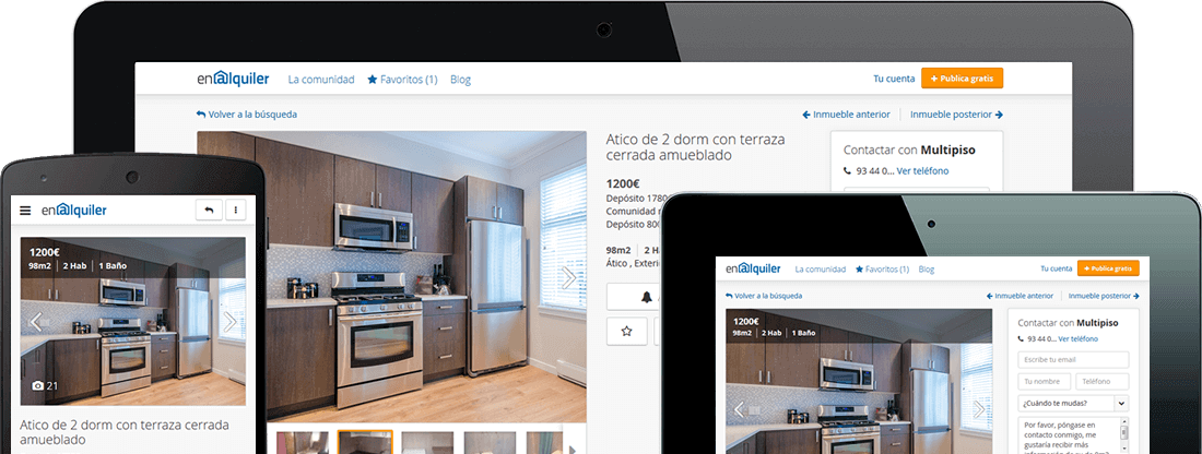
In November 2013, I started to work for enAlquiler as a UX Designer. I joined the Product team under the supervision of the Product Manager, Giuseppe Perri.
My main task was to carry out the portal redesign, including mobile device navigation, according to users’ needs.
This case study tries to summarize all the work carried out during the 10-month-redesign process.
enAlquiler’s Extreme Makeover
Back in November 2013, this is how enAlquiler website looked like this:
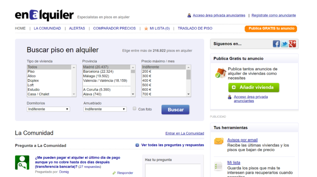
In that time, Responsive Web Design was fully established and mobile traffic had started to matter, but enAlquiler portal was not ready for none of that. The portal needed more than just a face-lift or new front-end look, it needed a total restructuring as well as adapting the experience to mobile navigation. In two words an Extreme Makeover.
The challenge was to innovate beyond enAlquiler products, and redesign the online portal to match users needs.
enAlquiler is used by both tenants looking for a new house to live in, and annoncers- real estate agencies and landlords – paying for having their flats advertised on the website. The challenge was to innovate beyond enAlquiler products and redesign the online portal to match the different users’ needs.
Who are the users? What do they care about?
Shortly after I started to work for enAlquiler, I asked if there were user profiles available, the answer was NO, and no user survey had been carried out since 2010. So, the Product Manager and I agreed that it was time to do a little research to focus our work.
First of all, I did some previous research using public statistical data resources, such as INE, Eurostats. The purpose was:
- Look at “the big picture” to identify who the tenants and the landlords were.
- Determine our sample size to be statistically significant.
The tenants: Survey
As the portal received visits from people all over Spain, we decided to approach the tenants through a survey, this would allow us to reach a greater and more heterogeneous number of people. Survey objectives were:
- Validate if our users matched the research.
- Get accurate information about their preferences and pain points when searching for a flat.
To distribute the survey we sent an email campaign to those users who had made a flat request or created an alert during the previous 15 days. 1595 people answered the survey, so we had plenty of data to analyze and we could also segregate large-cities-tenant behavior (Madrid and Barcelona) from tenant behavior of the rest of Spain.
Finally, to learn more about our users’ needs we analyzed enAlquiler-search logs to extract information about website visitors and what they wanted when searching for a new home.
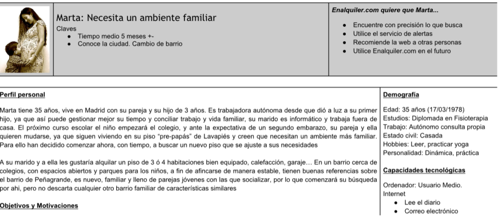
All those actions gave us insights about who our users were and what they cared about. All this data collection allowed us to create data-based Personas that we used during the whole redesign process.
The landlords/publishers: Historical data
Our approach to landlords was different. As the enAlquiler was an 8-year-old portal, we had the advantage of having historical data that allowed us to a better understanding of the landlord. To build the landlord Personas we used
- Database data: the average of flats published, time on-line, flat location, etc.
- Customer service information. We analyzed calls to customer service to came up with frequent issues.
- Requests made to the sales team: Sales teams were closely in touch with real state agents and they registered every petition, so this was a good source of information for future features.
Iterative Design Process
We worked in a continuous cycle of prototyping, testing, and making adjustments and refinements. During our incremental design process, we produced tons of prototypes in different supports such as paper, Balsamiq, or HTML.
From wireframes to reality
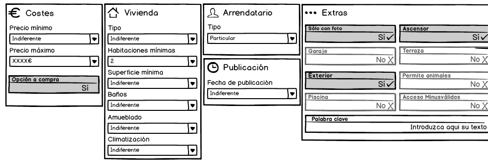
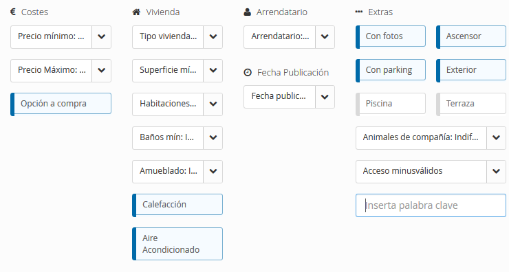
Here you can see an example of how the filtering options changed from UX production to final visual design:
Changelog
The redesign process, not only changed the portal’s look and feel but also enAlquiler’s information architecture, message, and functionalities changed a lot. The changes affected mainly to:
- Home page:
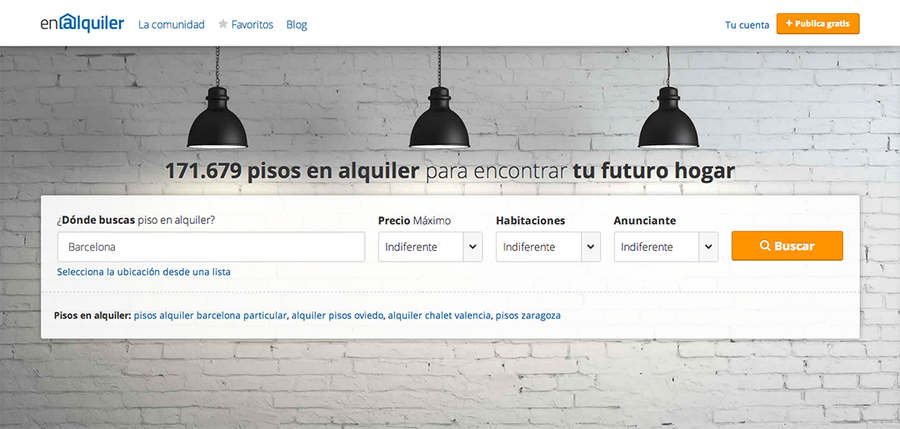
- Storytelling was introduced: “Find your new home”.
- The search form was simplified with an autosuggest field for location.
- Action prioritization when scrolling down: search for a property, publish a new property, services, and community inquiries
- Search results page:
- The refining filters were moved from the left side to the top of the page.
- This replacement gave us more space for the property listing, so we could design listings with larger photographs.
- Contact buttons and carrousel pictures available from the listing.
- Property detail page.
- Larger and detailed photographs.
- Important information on top.
- Social sharing.
- Landlord’s property management area:
- New graphic analytical dashboard to track properties performance at a glance.
- Bulk actions for managing publication: renew, unpublish, delete, highlight.
Usability Testing
During the usability testing sessions, we set up our casual laboratory in a meeting room. Our home-made lab consisted of a laptop equipped with screen recording software, which allowed us to simultaneously record the screen and the webcam image. Furthermore, we established a Skype connection with another computer that would allow the Product Manager or me to see and hear what was happening and taking notes.
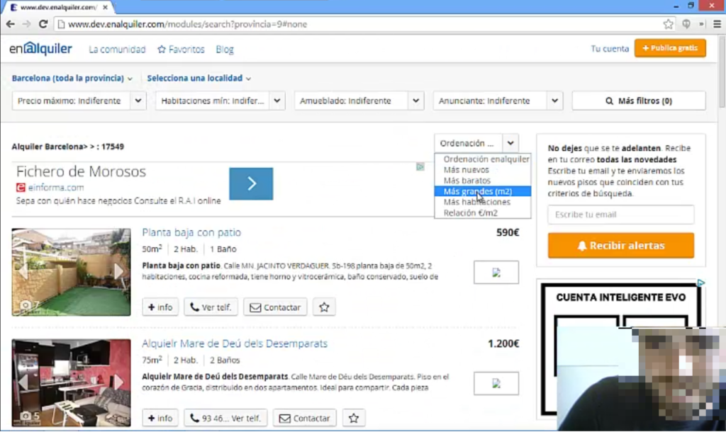
We had defined a 10-task test according to business objectives, and we carried out the test in an iterative way, so in every iteration, we recruited 5 people to test our prototype and after the tests, we evaluated the results and make changes, this process allowed us to assess the product evolution in each iteration.
Release
Finally, on September the 4th 2014, the new enAlquiler site came to light and it looked like this:
Outcomes
During the following weeks, we tracked our metrics in comparison to the pre-redesign portal. Some of the changes in our KPIs were:
- Clicks on the property phone ▲ increased by 20%.
- Form leads ▲ increased by 30%.
- New flat alert creation ▲ increased by 60%.
In terms of figures the redesign process was a success, our KPIs increased and the whole experience improved.
